

Apple •Spotify• Pocket Casts •Youtube •Overcast •RSS
What’s up everyone? Today is a bit of a follow-up on the previous episode about building dashboards, check that one out first if you haven’t already.
Today we’re taking this a step further and talking about data models and the limits of building dashboards.
Here’s a typical stance on dashboard design:
It is best to focus on the ideal scenario, and worry about the practicalities of implementation later...
Or “let the ops team worry about that” as they call it.
Haha yeah… This approach may seem appealing at first, as it allows designers to imagine and create without constraints. However, as a marketing operations person, I’m not a fan of this.
Here’s today’s main takeaway: I believe that understanding how a dashboard is powered, and having a sense of what is possible and what is not, is a crucial differentiator. Too often, I have seen dashboard projects built in a vacuum, disconnected from the reality of the data and the systems that support them. In these cases, valuable time and resources are wasted building an idealistic dashboard that cannot be implemented or used effectively.
Today we’re going to be breaking down how you can level up your knowledge about data models or the capabilities and limitations of the data and the systems that support the dashboard, and designing solutions that are feasible and effective.
By understanding these constraints, designers and marketers can create dashboards that are not only beautiful and engaging, but also practical and useful.
I feel like this topic could get hairy pretty fast, so let’s break down some definitions for the listeners. Da hell is a data model, let’s start there.
What’s a data model?
Data modeling is a way to organize and structure data from different sources in a consistent and useful way. It helps to make data more accessible and organized, so it can be easily analyzed and interpreted.
Gimme a non marketing example, how would you explain this to your mom?
Example: A simple example of a data model is a phone directory. The data model for a phone directory would include information such as the names and contact information of individuals, as well as the relationships between them (e.g. family members, colleagues, friends). By organizing this information in a consistent and structured way, the phone directory can be used to easily look up and contact individuals. This data model helps to make the information more accessible and useful.
Okay what about a marketing example, that was too simple.
I’ll go with my bread and butter, Email marketing example: One example of a data model for email marketing might include information about the email campaigns that have been sent to different segments of your audience.
This data model might include details such as
- Subject lines,
- Type of content,
- Subject line keywords
- Main call-to-action
You would also have the results of the campaigns
- open rates,
- click-through rates,
- conversion rates
By organizing and structuring this information in a consistent and meaningful way, the data model can help the email marketing team track the performance of their campaigns and to identify areas for improvement.
For example, the data model might show that certain subject lines or content types don’t generate as many opens as some emails but they perform better at driving clicks and conversions, and the email marketing team can use this information to optimize their future campaigns.
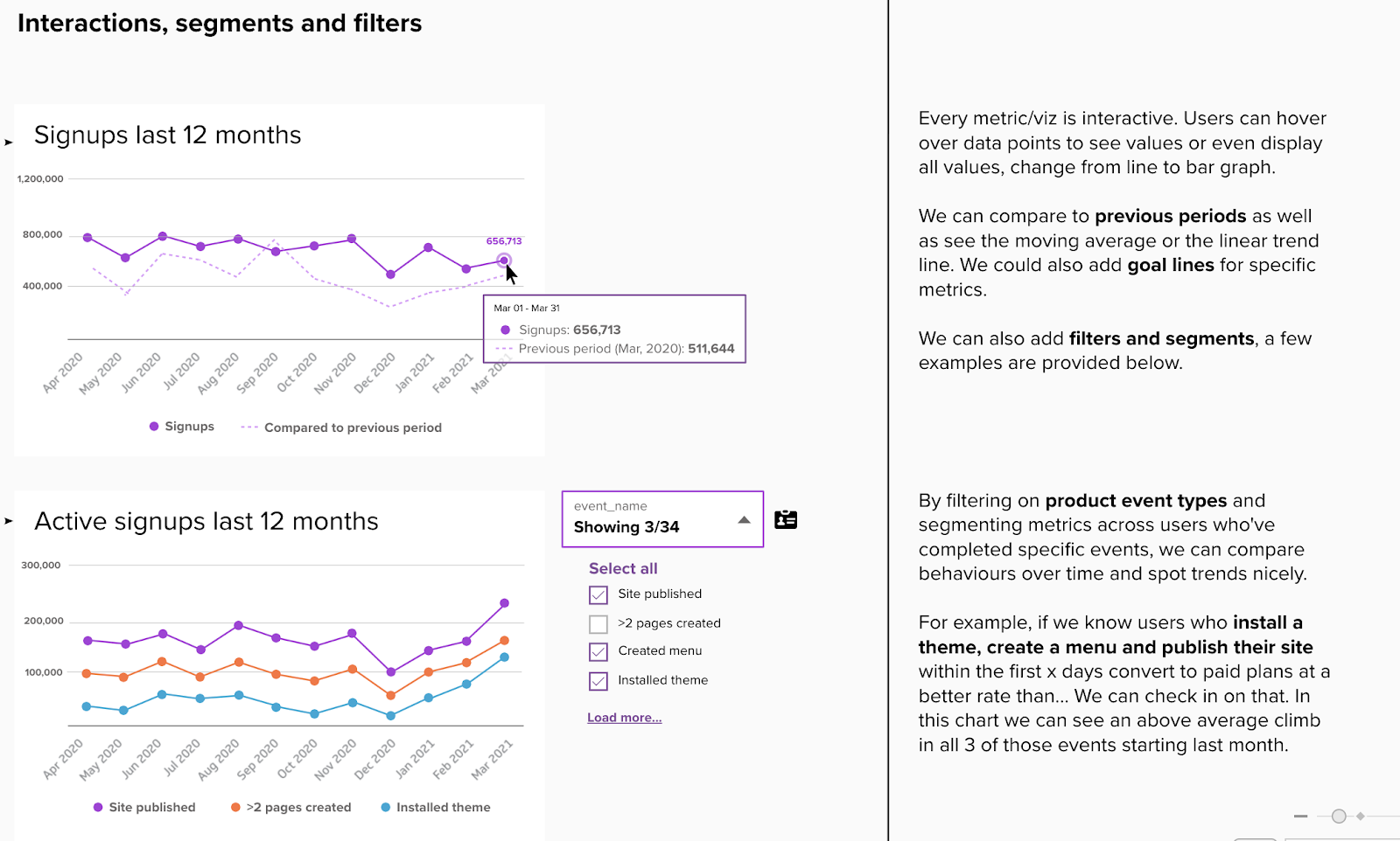
So why should marketers care about this? It’s to prevent shiny object syndrome and understanding where the numbers are coming from but also give you the ability to customize your dashboard.
Exactly. A data model is the first step in allowing you to have a dynamic/interactive dashboard.
Describe an interactive dashboard in simple terms
Describe an interactive dashboard in simple terms for the listeners.
It’s being able to interact with the charts and elements to analyze different parts of your dashboard, for example; filtering certain elements and changing date ranges.
This is what sets them apart from reports. For me, I see it as a personal assistant of sorts. An interactive dashboard allows you to easily filter, slice, and drill down into the data, revealing insights and patterns that might otherwise be hidden. Unlike a static dashboard or report, which shows the same view for everyone, an interactive dashboard lets different users explore the data in their own unique ways.
What’s a simple example that most folks would understand?
Imagine a sales manager who needs to understand the performance of her team across different regions and product lines. With a static dashboard or report, she would see the same view for everyone, with no ability to filter or drill down into the data.
But with an interactive dashboard, she can easily select the regions, the individual reps and product lines that she is interested in, and see the data that is most relevant to her. She can even save her custom views, and share them with her team, so they can all see the data in the way that is most useful to them.
Basically, a dynamic dashboard allows you to go from metric reporting to data exploration and analysis.
In episode 64 we talked about GA4 so I have a GA example here.
Consider the following scenario: your marketing team has built a Google Analytics (GA) dashboard that shows monthly traffic data. The dashboard is static, which means that it updates every month, but it does not allow you to filter or drill down into the data. When you log in to the dashboard, you see the same view as everyone else, with no ability to customize or explore the data in your own way.
Now imagine that, instead of a static GA dashboard, your marketing team has built a dynamic lifecycle dashboard that is powered by a data model. This dashboard allows you to filter the metrics by user attributes or campaign events, so you can see the data that is most relevant to you.
For example, if you want to see how your email campaigns are performing, you can easily filter the metrics by channel. Or, if you want to see the impact of in-app messages, you can filter the metrics by that attribute. And, because the dashboard is dynamic and interactive, you can explore and analyze the data in your own way, without being limited by the pre-defined views of a static dashboard.
Yeah. So where does the data model fits into this? Well the data model is what allows you to have a dynamic dashboard, especially when it comes to combining data from different sources.
So data source > data model > dashboard? Is that the hierarchy?
Yeah I think that’s fair.
Understanding your data model
So here’s a practical example:
Let’s say we have two main data sources:
- New signup events from your product or website
- Someone signs up for our product and they tell us
- Use case and we
- Score them
- Email events from your MAP
- Email name
- Engagement timestamps
So how can we structure this data and potentially join it together?
I see where you’re going with this. Email or user ID right? They signup using an email and you’re obviously sending emails to their email.
Correct. Maybe a user ID or an email address. So in your data model we can group signup events and attributes with email events and engagement.
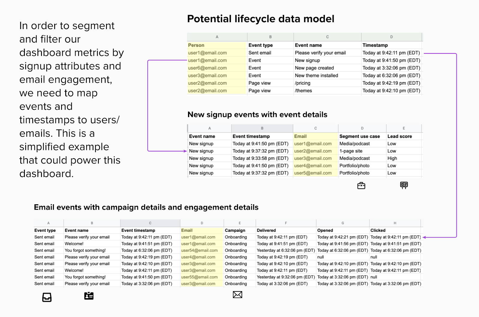
So this is obviously going to be very different at every company. The stage of where a company is at in terms of data strategy greatly depends on priority and team size.
But it’s super powerful.
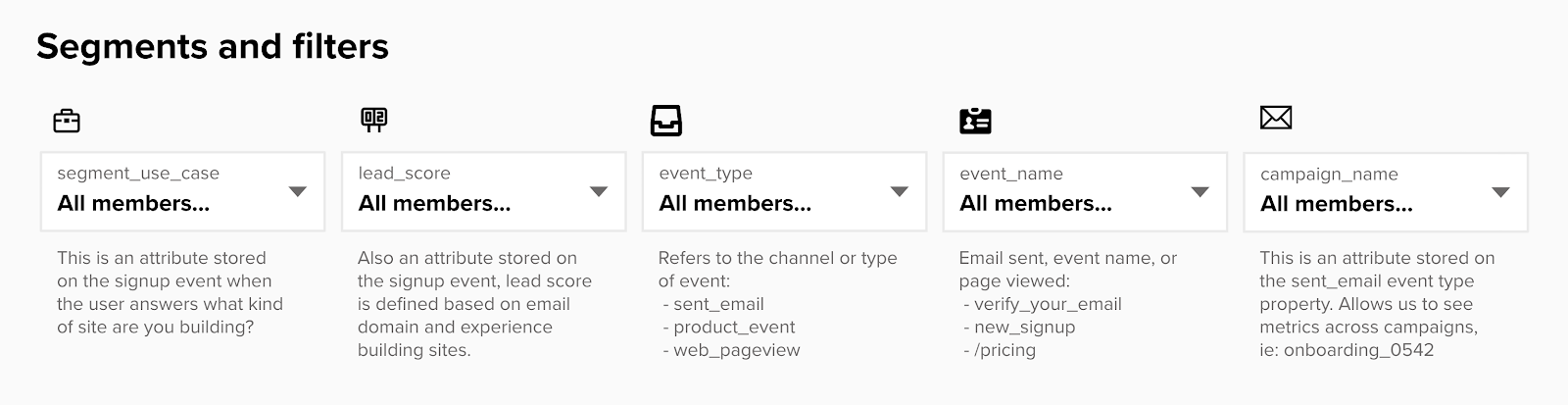
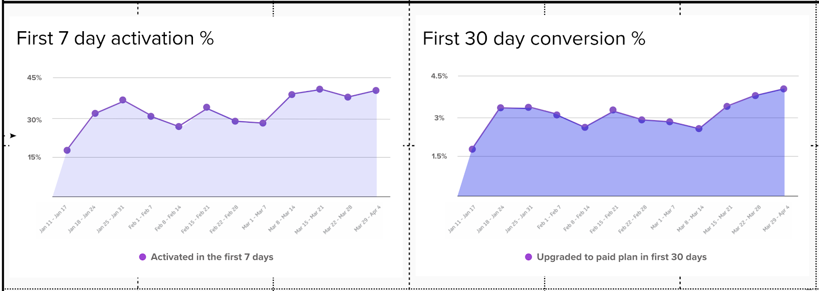
Yeah right off the bat, examples that come to mind are things like if you’re looking at free trial signups in the first 30 days, you can segment that metric by use case to see if a certain persona is more popular or look at conversion rates by persona. Or you can filter it by users who engaged with an email, how did they perform vs those who didn’t engage with that email.
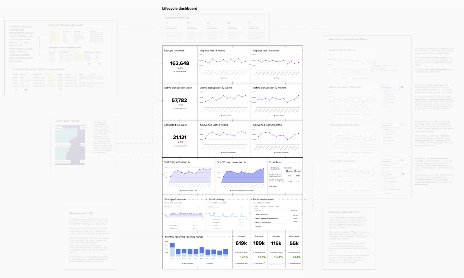
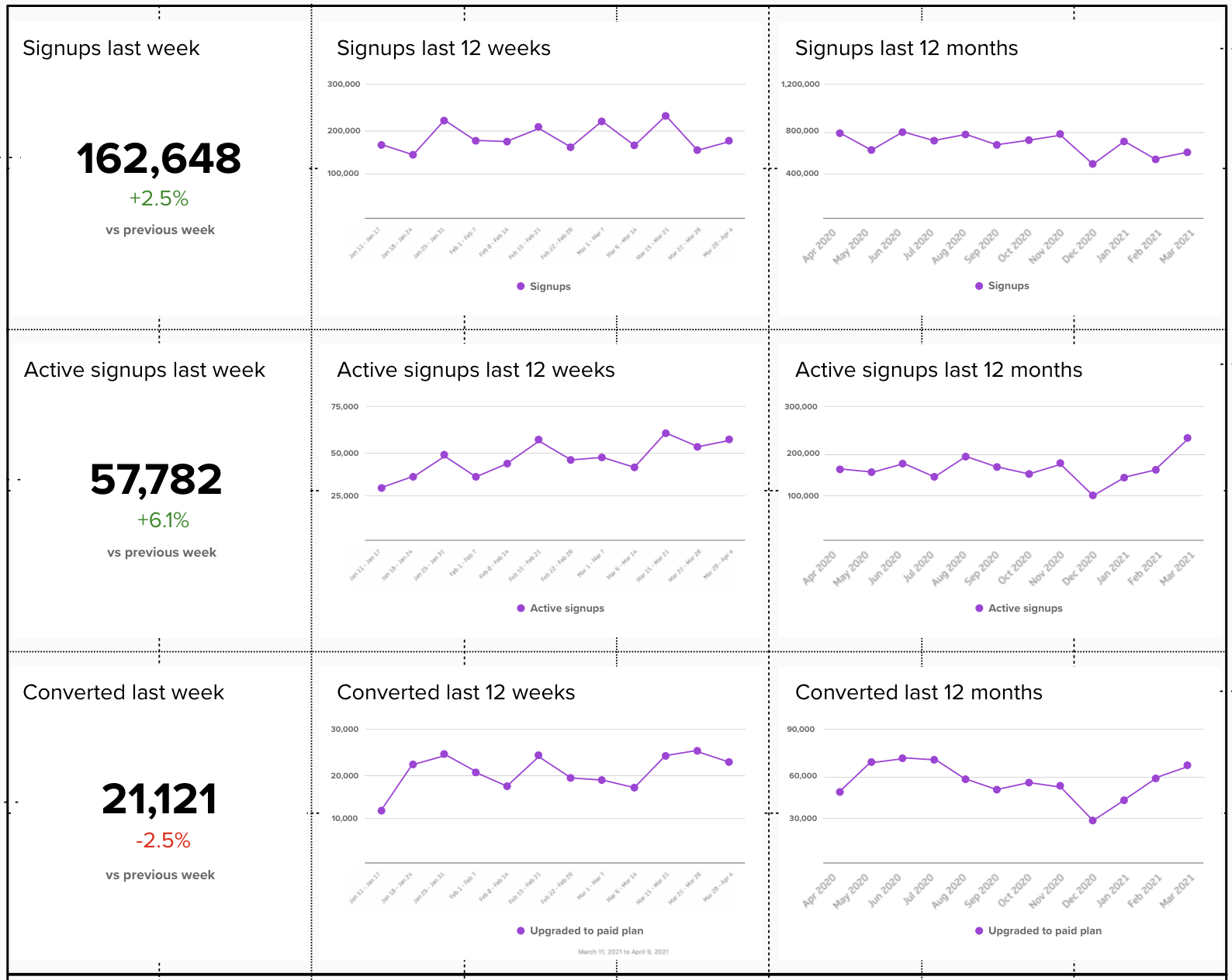
Yeah on our site for this episode I’ll drop some visuals to help explain this a bit more (below). But imagine key metrics like signups, active free accounts and converted users over the last 12 weeks. And Then imagine being able to filter this data by only looking at users who said they were building a photography website. Or users who had a certain lead score or engaged with a certain campaign or not.
Conclusion
Ultimately our thesis here is that even understanding some of these basics of data models will help you better grasp the limits of your dashboard potential and instead of spending time building a dream dashboard that isn’t currently possible given your current data, you can save time and build something practical and useful.
Think of a dashboard as a map, guiding your marketing team through the data landscape. Just like a map, a dashboard needs to be accurate, relevant, and easy to use in order to be effective.
However, creating a great dashboard is not as simple as drawing a map. It requires understanding the terrain, the data sources, and the models that support the dashboard. It requires knowing what is possible, and what is not.
Yeah love that analogy, without this understanding, it’s easy to get lost in the data landscape, creating a dashboard that is beautiful but impractical, or engaging but irrelevant.
In short, understanding how a dashboard is powered is not a requirement for all marketers, but it is a valuable skill that can make a big difference. By understanding how a dashboard works, designers and marketers can create a map that is not only beautiful and engaging, but also practical and useful.
✌️
—
Intro music by Wowa via Unminus
Cover art created with Midjourney
Apple •Spotify• Pocket Casts •Youtube •Overcast •RSS
Related tags
<< Previous episode
Next episode >>
All categories
- AI (104)
- career (65)
- customer data (64)
- email (64)
- guest episode (177)
- operations (127)
- people skills (34)
- productivity (10)
- seo (15)
See all episodes
Future-proofing the humans behind the tech
Apple •Pocket Casts•Google •Overcast •Spotify •Breaker •Castro •RSS